PORTFOLIO
Pretty Panty E-Commerce Site
 Project: Pretty Panty E-Commerce Website
Role: Designer & Developer
Date: March 2016
Website: http://prettypanty.com [site has since changed, you can view what the wayback machine managed to capture here here ]
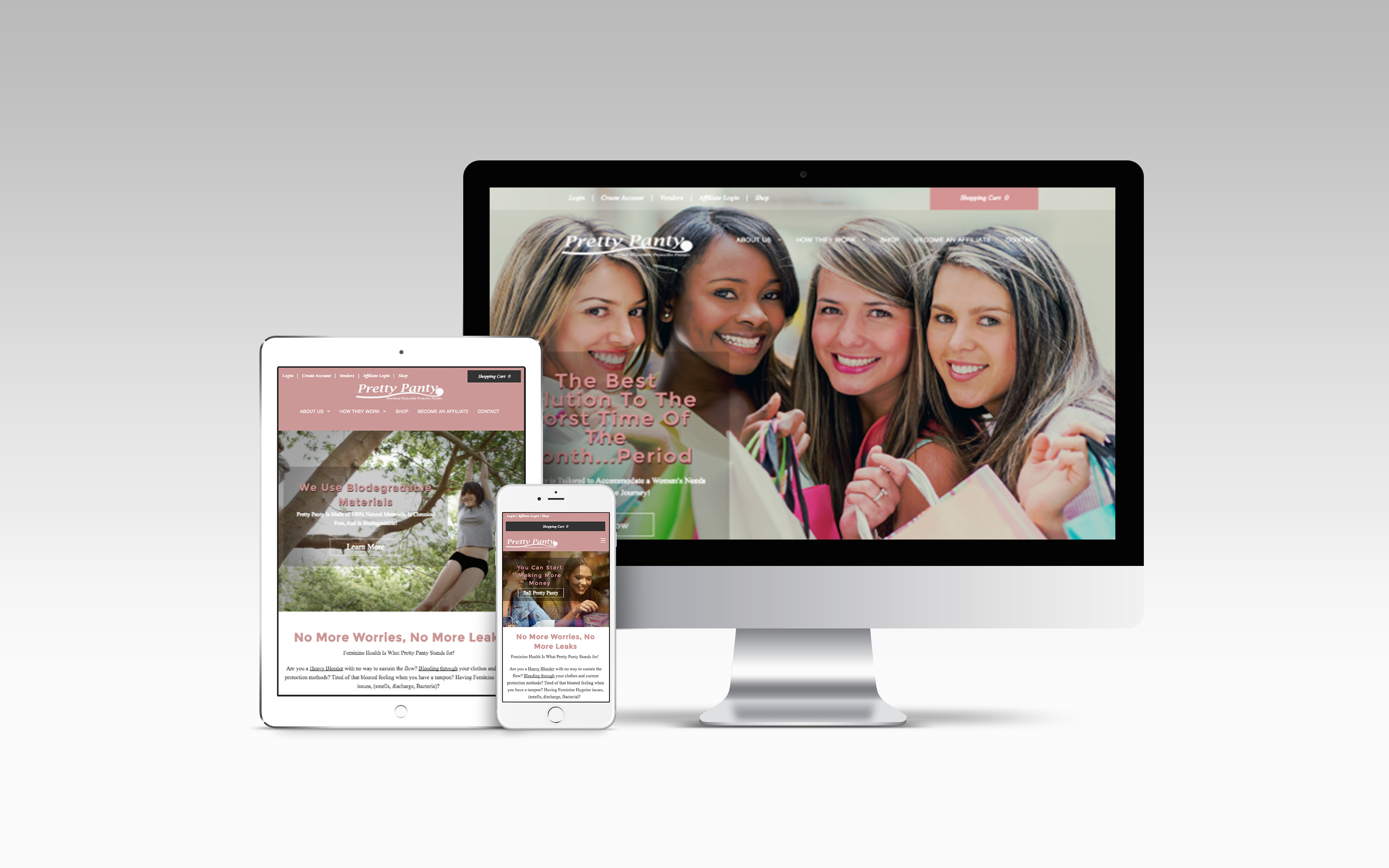
Description: An e-commerce website created for the Pretty Panty products as part of the Vette Marketing Team. I was under a tight time constraint, and used Adobe Business Catalyst as a CMS with their backend e-commerce capabilities to build out the site fast. The client had very specific requests and I wanted to fulfill them while still creating a great experience.
GOALS
- Create a well-designed, easy to navigate site.
- Create a site that is fun, playful, slightly upmarket, and very feminine
- Bring attention to the current products

After researching the target client, competitors, and companies that the client wished to emulate, I compiled a list of the design patterns that would work best for the site that the client wished to have. There were a lot of layout commonalities. They all had hero slideshows of images, top horizontal navigation that condensed to a hamburger menu, and a specific type of email newsletter signup on every page.
Though there really wasn't time or the budget to conduct proper testing, I had in my network a few people who were the target customer who were willing to do a quick test as a favor. I used this information to inform my design choices. To make the site more navigable from the homepage for the menu-averse user I decided to create a full-screen section and dedicate space for every page. For example, one section displayed the products with color options, another section gave short about, and there was one with the ever-present email sign-up. The menu could be easily accessed from every page in several places and would help prevent their customer from getting lost in the site.
Once my wireframes and chosen images were approved by the client, I received the current logo and branding information, which informed my visual design choices, and the build went pretty quickly. I started with a pre-existing Adobe Business Catalyst template solely for the pre-built e-commerce feature, but the site was created custom for the client.
THE RESULT
Client was extremely pleased with the functionality of the site, and was so pleased with the visual design of the site that she requested our agency to rework her logo and re-design the product packaging. This can be viewed here