PORTFOLIO
VACATION EXPRESS
DESTINATION PAGES REDESIGN
 Project: Update 20+ Destination Pages on Vacation Express' Website
Role: Designer
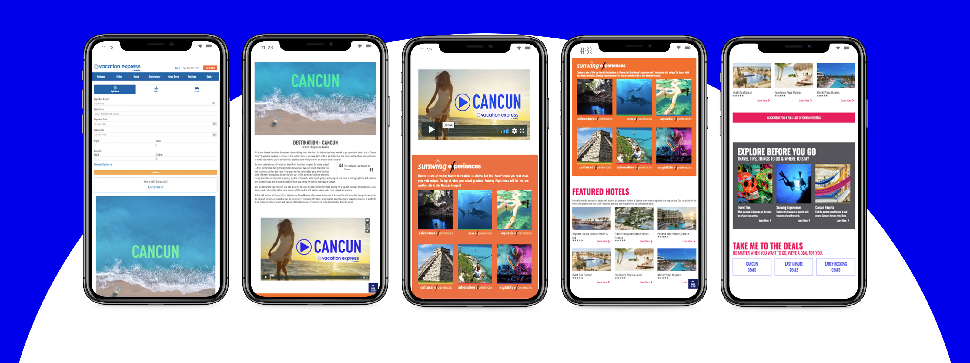
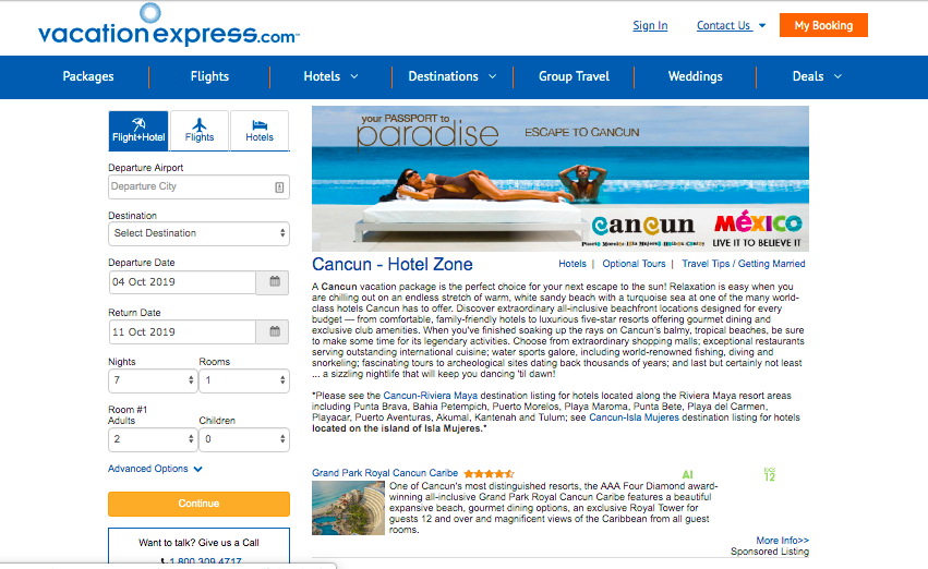
Website: vacationexpress.com/cancun/
Project Overview: As part of a larger initiative to update the Vacation Express website, my team and I were tasked with redesigning over 20 destination pages to make them more engaging, visually appealing, and user-friendly for both direct consumers and travel agents. The goal was to create a more interactive and streamlined vacation booking journey, while also ensuring the design was aligned with new branding guidelines.
-
Engage users: Create visually compelling destination pages with interactive elements that generate excitement about booking a vacation.
-
Improve usability: Improve usability: Enhance the ease of navigation and information findability.
-
Align with new branding: Update the design to match the recently implemented branding guidelines across other site areas.
Objectives
-
User Resistance: Our target audience of travel agents and direct users skewed older, and was resistant to change, requiring us to take a careful, user-centered approach to design.
-
No Dedicated UX Team: With no dedicated UX designers or researchers on the team, we relied on our own creativity and self-taught UX principles to guide the design process. We were learning as we went, exploring and applying core UX methodologies, such as user research, wireframing, and testing, to ensure a seamless experience for our users.
-
Technical Limitations: The integration of our booking software and search tools meant we had to build responsive solutions that worked seamlessly across devices.
CHALLENGES & CONSTRAINTS
The Design Process:
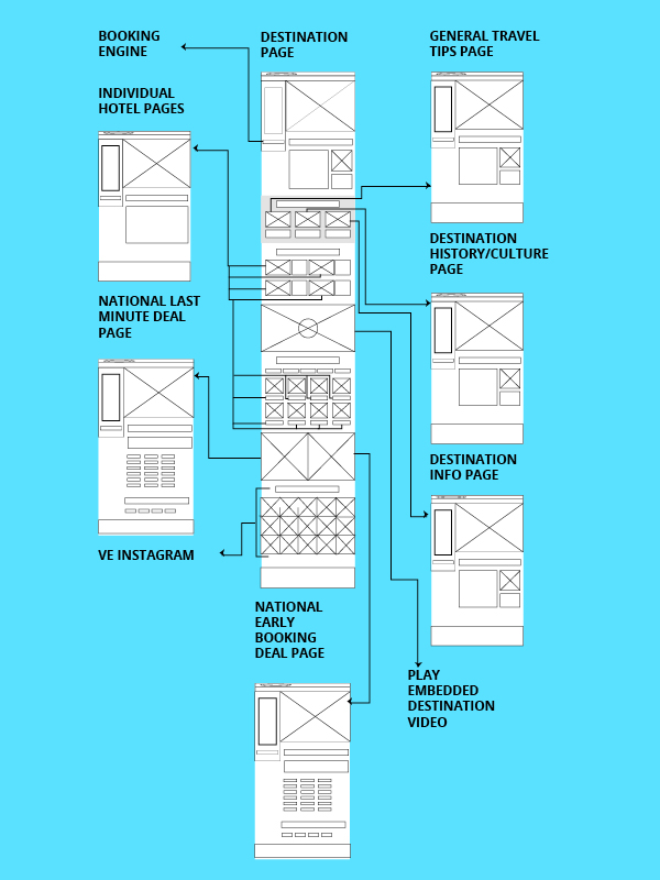
The project began with an internal team brainstorm, where we each created wireframes based on user research and analytics. We presented these ideas in a team critique, where we combined the best, most feasible solutions. After narrowing down the most effective layout options, we tested the designs with five of our least tech-savvy travel agents and members of our sales team to gather feedback.
-
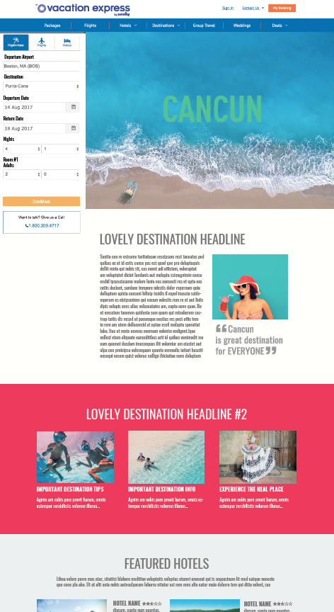
Wireframes & User Flows: I developed wireframes for desktop views, mapping out intuitive user flows and incorporating feedback from our team.
-
High-Fidelity Mockups: Once the wireframes were finalized, I translated them into high-fidelity mockups that included branding elements and interactive features. These mockups were presented to key stakeholders, including the CEO and Marketing Director, for approval.
-
HTML Prototypes & Testing: After receiving approval, I worked with the team to develop HTML prototypes, which we then tested with our users. Feedback from the sales team and users helped us identify and fix any last-minute pain points before launching the final pages.
Final Solution: Once the final mockups were approved and tested, the pages were implemented live across the website. The new destination pages were fully responsive, interactive, and aligned with the brand’s updated design system.
THE RESULTS
40% increase in discoverability of key information, making it easier for users to navigate and find details.
28% increase in conversion rates from destination pages, showing that the redesign was effective in driving user action.
Positive user feedback: Both our internal teams and end users praised the improved experience and easier navigation.
Stakeholder Satisfaction: Key stakeholders, including the CEO and Marketing Director, were extremely pleased with the redesign and its impact on both engagement and sales.
KEY TAKEAWAYS
Once the final mockups were This project was an incredible learning experience. As a team, we had to rapidly learn UX principles and apply them in real-time, from user research and wireframing to testing and iteration. We taught ourselves new methods, refined our processes, and applied our newfound knowledge to solve design challenges. It also reinforced the importance of considering edge-case users and ensuring a design is both accessible and functional for diverse audiences. Ultimately, this redesign was successful in making the destination pages more engaging, user-friendly, and aligned with business goals.